Civ 7 UI: Bad as Rumored?

The Deluxe Edition of Sid Meier's Civilization VII has just hit the market, and the internet is already buzzing with opinions on its user interface (UI) and other aspects. But is the UI truly as problematic as some claim? Let's delve into the details and evaluate the UI's effectiveness in the context of a 4X game.
← Return to Sid Meier's Civilization VII main article
Is Civ 7's UI as Bad as They Say?
S Civilization VII has been out for only a day for Deluxe and Founder’s Edition owners, and it's already receiving criticism, particularly for its UI. While it's easy to join the chorus of complaints, it's crucial to assess the UI objectively. Let's break down the UI elements and see if they meet the standards expected of a 4X game.
What Makes a Good 4X UI?
Designing a good 4X UI involves more than just following a set of rules. The context, style, and objectives of the game play significant roles in what makes a UI effective. However, experts have identified common elements that are typically effective across many 4X games. Let's evaluate Civilization VII's UI based on these criteria.
Clear Information Hierarchy
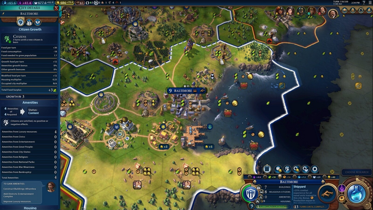
A clear information hierarchy is essential for a 4X UI, ensuring that the most important and frequently used data is easily accessible. In Civilization VII, the resource management UI provides a good starting point. It organizes resource allocation across your empire into income, yields, and expenses through dropdown menus, presented in a table format for easy tracking.
However, the UI could be more effective with additional granularity. While it shows resource distribution by district, it lacks detailed breakdowns by specific hexes or districts. Moreover, the expense section only accounts for unit upkeep, missing other costs. Despite these shortcomings, the UI is functional and could be improved with more detailed information.
Effective and Efficient Visual Indicators
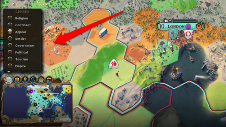
Visual indicators are crucial for conveying information quickly and efficiently. Civilization VII uses iconography and numerical breakdowns effectively for resources. The tile yield overlay, settlement overlay, and settlement expansion screen are notable examples that help players understand resource availability and city planning at a glance.
However, the absence of certain visual lenses present in Civilization VI, such as those for appeal, tourism, and loyalty, has been a point of contention. Additionally, the lack of customizable map pins is a notable omission. While the UI isn't terrible in this aspect, there is room for improvement.
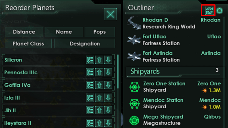
Searching, Filtering, and Sorting Options
In a game as complex as Civilization VII, the ability to search, filter, and sort information is vital for managing the vast amount of data. Unfortunately, the game lacks a search function, a feature that was highly praised in Civilization VI. This absence significantly impacts the game's usability, making it harder for players to navigate and find specific information.
The hope is that Firaxis will address this in future updates, possibly enhancing the Civilopedia's functionality as well.
Design and Visual Consistency
The design and visual consistency of Civilization VII's UI have drawn mixed reactions. While Civilization VI embraced a vibrant, cartographical style, Civilization VII opts for a more minimalist and sophisticated look, using black and gold to convey regality and refinement.
This design choice aligns with the game's overall aesthetic but may not resonate with all players. The UI's subtle thematic direction can make it less immediately engaging for some. Despite this, the UI does not feel cheap or amateurish; it's just a matter of personal taste.
So What’s the Verdict?
It’s Not The Best, But Undeserving of Such Disapproval
After evaluating Civilization VII's UI against the key criteria for a good 4X interface, it's clear that while it has its flaws, it is not as bad as some claim. The absence of a search function is a significant drawback, but it's not a game-breaking issue. The UI's design may not be to everyone's taste, but it is functional and aligns with the game's overall aesthetic.
In the grand scheme, Civilization VII's UI has room for improvement but is far from the disaster some make it out to be. With potential updates and player feedback, it could evolve to meet more of the community's expectations. For now, it's a UI that, while imperfect, still supports the strong gameplay that Civilization VII offers.
← Return to Sid Meier's Civilization VII main article
Sid Meier's Civilization VII Similar Games


- 1 Tomorrow: MMO Nuclear Quest Is a New Sandbox Survival RPG Nov 15,2024
- 2 Marvel's Spider-Man 2 Swings to PC in January 2025 May 26,2023
- 3 Black Myth: Wukong Review Fallout Nov 13,2024
- 4 Final Fantasy XVI PC Port Falls Short Nov 14,2024
- 5 GTA 6 Raises The Bar and Delivers on Realism Beyond Expectations Nov 10,2024
- 6 Roblox Ban in Turkey: Details and Reasons Mar 10,2024
- 7 Stellar Blade PC Release Date Confirmed For 2025 Jan 05,2025
- 8 Dragonite Cross-Stitch Captivates Pokémon Enthusiasts Nov 08,2024
![Business of Loving [v0.12.5i] [Dead End Draws]](https://imgs.96xs.com/uploads/18/1719555107667e5423ef803.jpg)


-
Best Racing Games to Play Now
A total of 10
-
Explore the World of Shooting Games
A total of 10
-
Best Free Simulation Games for Your Android Phone
A total of 4